There are four shapes a post can take, and the choice matters less than people think — as long as the layout was made for the shape rather than cropped into it. This is what the four are, in pixels, and how to pick without thinking about it every time.
The four frames
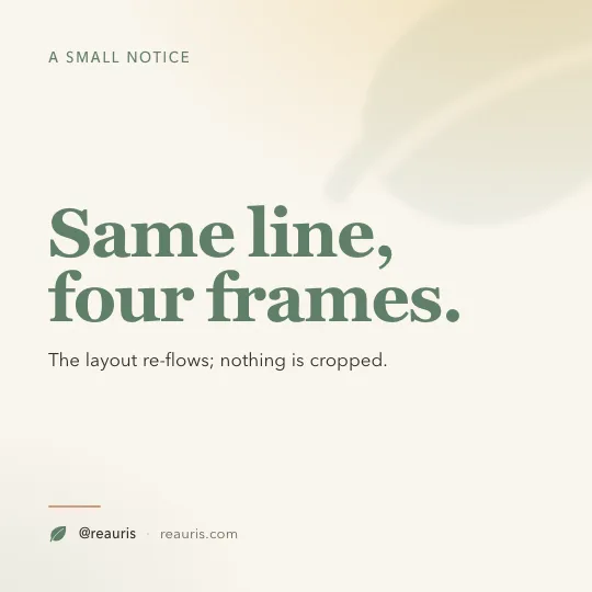
The feed. Safe everywhere; the shape a quote wants.
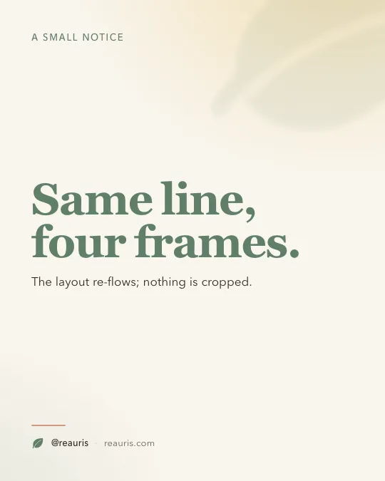
The feed, taller. Takes more of the screen as someone scrolls; the default for anything with a list.
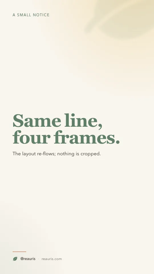
Stories and Reels. The whole phone. Keep the top and bottom clear.
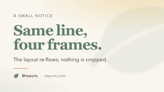
Link previews on X, LinkedIn and Facebook. Not the Instagram feed.
Width is always 1080 on Instagram; the platform scales anything wider down and anything narrower up, and up is where it gets soft. The feed accepts anything between 1.91:1 (wide) and 4:5 (tall). Taller than 4:5 is cropped in the feed even though it will show in full when tapped.
1:1 — the square
The safe one. It looks right in the feed, in the grid, in a DM, in a screenshot someone shares. If a post is a single line — a quote, a permission, a small notice — square gives it air on all four sides, which is what a single line wants.
4:5 — the tall feed post
The same width, 25 % more height. In the feed that is 25 % more of the screen while a thumb is moving, which is why most brands that post lists, steps and tips post them at 4:5. Anything with three or more lines of body text is easier to read here. The trade is the grid: Instagram shows the profile grid as tall rectangles now, so 4:5 previews well, but a square will be cropped top and bottom in the grid — worth knowing if the grid is something you curate.
9:16 — Stories and Reels
The whole phone, vertically. Two things go wrong. The first is putting anything important in the top 250 pixels or the bottom 320: the profile bar covers the top and the reply field covers the bottom, and on Reels the caption and the buttons take the right edge too. The second is treating a still as a Story: a still with nothing moving reads as an ad. A slow push on the photo with the line arriving is enough.
16:9 — the link preview
Not an Instagram shape at all. When you share a link on X, LinkedIn or Facebook, the picture in the card is wide. If your post is a link, make the image for that; if it is a picture, do not — X will show a 1:1 or 16:9 picture in full and LinkedIn will show a 4:5 one taller than a 16:9 one, so the tall picture gets more room.
How to choose without choosing
- One line: 1:1.
- A line and a list, or a photo with a line under it: 4:5.
- Something that should take the whole phone for six seconds: 9:16, and make it move.
- A link: 16:9, and only for the platforms that show a link card.
The part that actually saves time is not the choice; it is not having to re-lay-out the card when you change it. A layout built from tokens re-flows into the new frame — the type scales, the margins hold, the mark stays where it was — so the same line can go out as a square today and a Story tonight without anyone opening a design tool. That is the whole reason the four pictures above are the same card.
The numbers, for the wall
- Feed: 1080 × 1080 (1:1) or 1080 × 1350 (4:5). Accepted range 1.91:1 to 4:5.
- Stories and Reels: 1080 × 1920 (9:16). Keep roughly 250 px clear at the top and 320 px at the bottom.
- Link previews: 1200 × 675 (16:9) on X and LinkedIn; Facebook is happier at 1200 × 630.
- File size: X and Threads refuse images over 5 MB. A flat card as PNG is a few hundred KB; a photo should be a JPEG.